Web Design Header

GRAPHIC DESIGN

Graphic design is the art of visual communication through posters, flyers, prints, and advertisements. It is a form of design that allows the human mind to think, interpret, and connect through imagery, typography, color, and layout. At its core, graphic design is not just about making things look good, but about communicating ideas clearly and intentionally.

The most effective graphic design is often simple yet daring. It relies on strong imagery, thoughtful composition, and purposeful use of space, using fewer words to say more. Good design guides the viewer's eye, evokes emotion, and creates meaning without overwhelming the audience.

Graphic design also plays a powerful role in representation and accessibility. Through visual language, designers can make people feel seen, heard, and understood across cultures and communities. From branding and advertising to digital media and social platforms, graphic design shapes how we experience the world around us and how information is shared in everyday life

Bodoni

Programs / Languages Used

  • photoshop iconPHOTOSHOP
  • illustrator iconILLUSTRATOR

Bodoni

The Bodoni poster project focused on showcasing a typography artist and creatively representing the typeface. I chose a fashion theme because Bodoni has a strong connection to luxury fashion, including Vogue, Yves Saint Laurent, and other Italian fashion influences. Since Bodoni is known for its elegant, high-contrast, upscale appearance, I designed the poster to feel stylish, refined, and fashion-forward.

Date made: spring 25'

Date published: 03-22-26

Cameo Designs

Programs used

  • illustrator iconILLUSTRATOR

cameo Designs

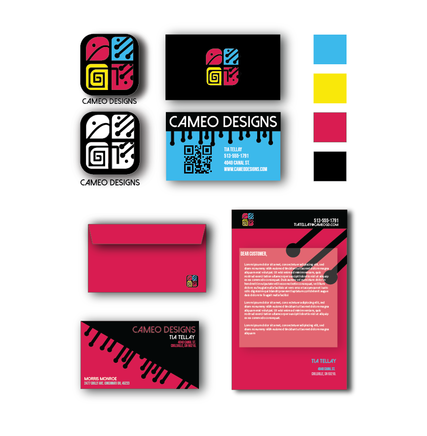
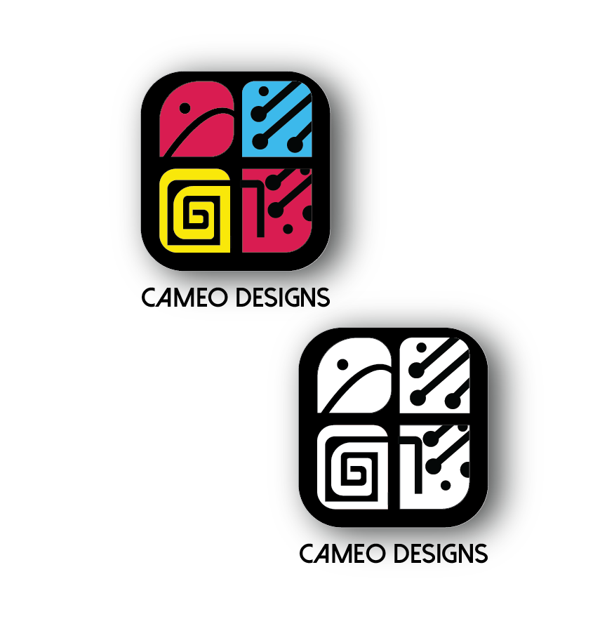
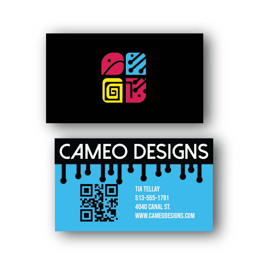
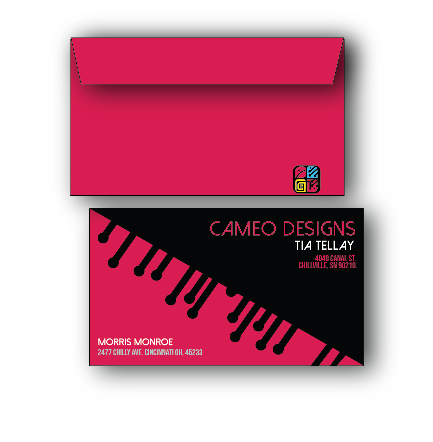
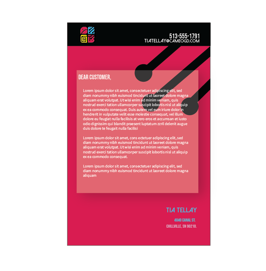
The Cameo Designs logo was created for a graphic design studio. Each part of the logo represents an aspect of the graphic design industry. The chameleon’s head is designed to resemble the pen tool in Adobe Illustrator, connecting the logo to digital illustration. The wire-like pattern on the chameleon represents technology, while the tail wraps around to form the letters “GD” for graphic design. I used a CMYK color palette to represent the print side of design, bringing both digital and print elements together in one logo.

Date made: spring 25'

Date published:03-22-2026

Jarts

Programs / Languages Used

  • photoshop iconPHOTOSHOP
  • illustrator iconILLUSTRATOR

Jarts

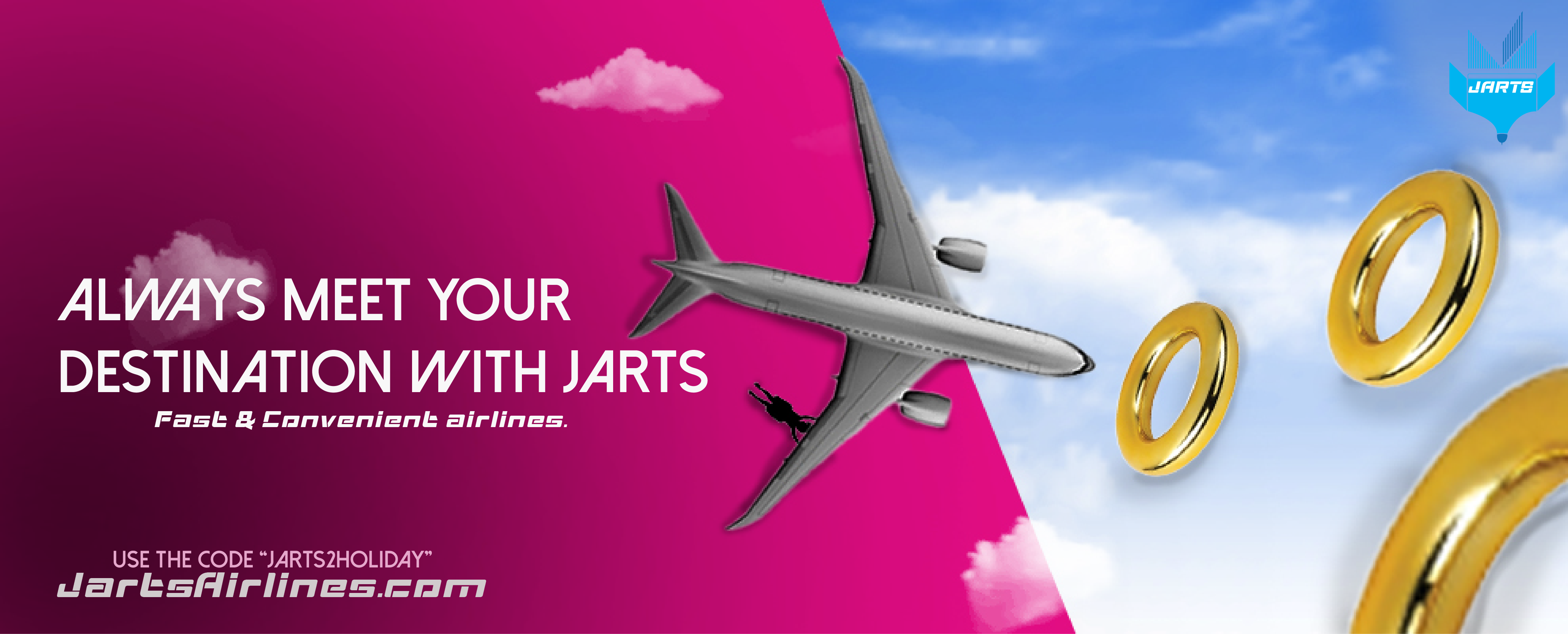
Jarts was a challenge in class to create an ad for the band toy Jarts and rebrand it. I started off by gathering some research and automatically I thought of a plane from its shape and purpose. I thought to myself why not an Airline service. I picked the logo blue to compliment the main colors used for Jarts back in the day. I also see blue often in airline logos to represent the blue skies. I wanted to highlight the danger to kids in my advertisement, so I chose to picture the child in a danger position while also promoting the benefits of the airline that no guest gets left behind. I’m sure everyone has a story where they almost missed a flight. Jarts airlines cater to their customers and provide options for little to no fees to prevent these types of situations.

Date made: fall 25'

Date published: 03-22-2026

I am Type

Programs used

  • illustrator iconILLUSTRATOR

I am Type

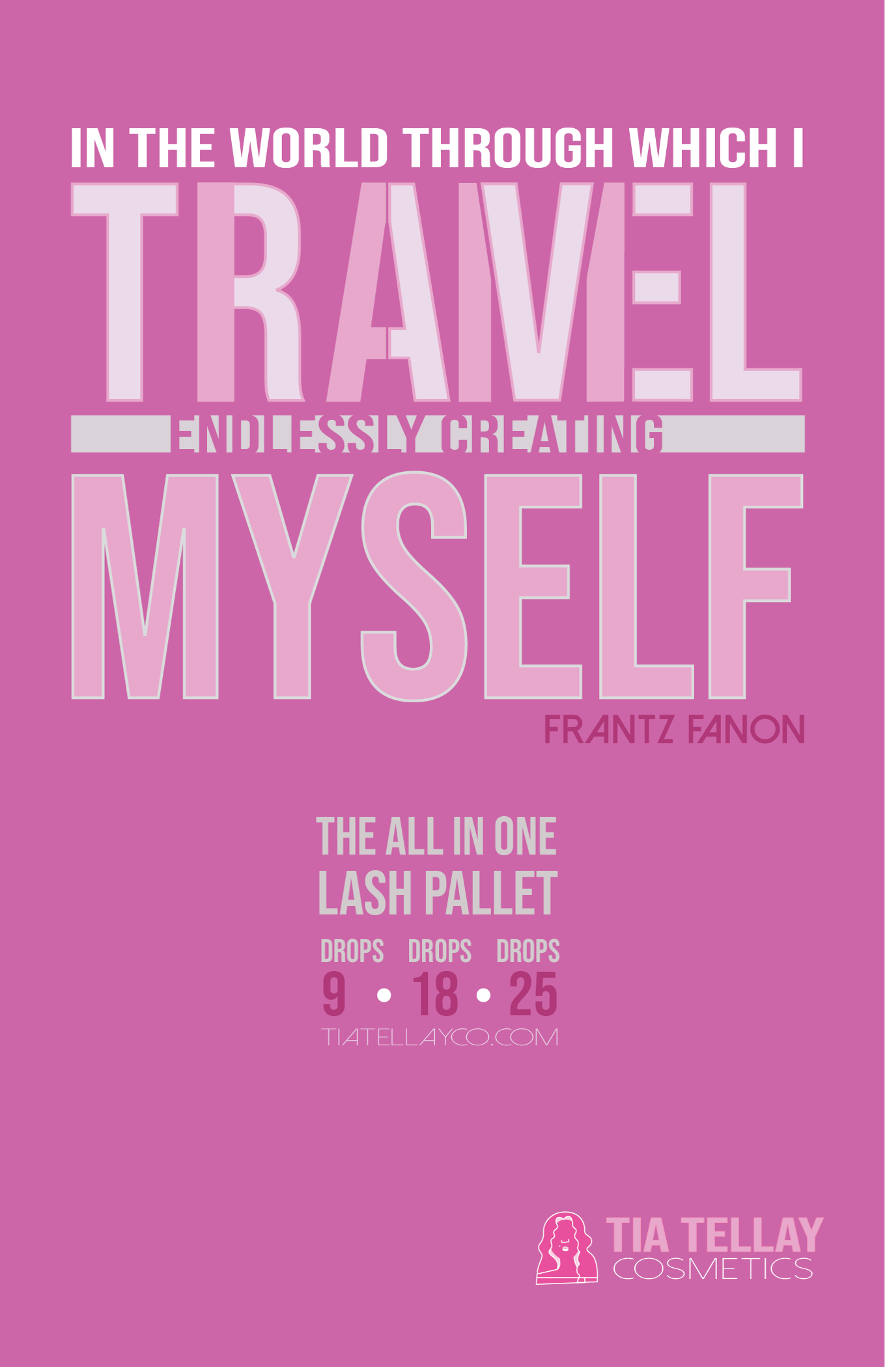
This project was created to show visual hierarchy through a branded poster design. I chose to promote my business, Tia Tellay Cosmetics, and advertise a new lash palette drop. I used the brand’s logo colors throughout the poster to create consistency and strengthen the overall identity.
The concept plays on the phrase, “In the world which I travel, I am endlessly creating myself.” This connects to the lash palette because it is travel-friendly and easy to use anywhere, while also representing self-expression and personal growth. I wanted the poster to show that cosmetics are about having fun, enhancing yourself, and feeling confident, rather than feeling insecure.

Date made: fall 25'

Date published:Date published: 03-22-2026

PegaKicks

Programs used

  • photoshop iconPHOTOSHOP
  • illustrator iconILLUSTRATOR

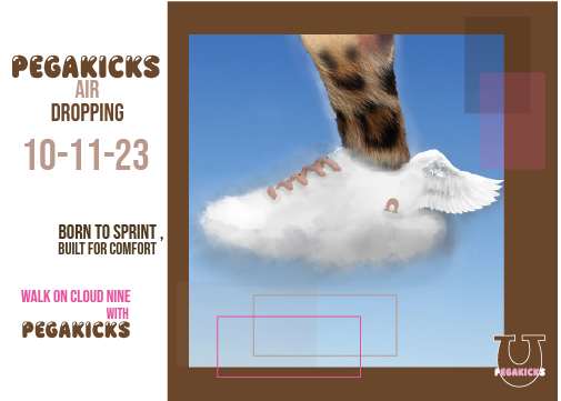
Sky Walkers was a trampoline/shoe advertisement project where I explored the ideas of speed and comfort. I morphed one of the fastest animals in the world with the shoe to represent how fast and powerful the shoe feels. To show comfort, I incorporated cloud imagery and used my own custom cloud brush to create a soft, lightweight effect. The overall concept shows the shoe as both fast and comfortable.

Date made:fall 25'

Date published:Date published: 03-22-2026

Fortune Fold Press

Programs used

  • illustrator iconILLUSTRATOR

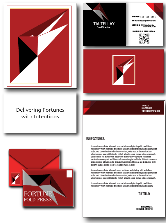
Fortune Fold Press was a group project where each team was challenged to create and present a logo and tagline for a Chinese New Year inspired brand. My team's company was Fortune Fold Press, and my concept was inspired by the folds of an origami crane.

I used the crane to represent Eastern culture, where cranes are often associated with wisdom, nobility, and longevity. I also wanted the design to connect to Western symbolism, where cranes are sometimes associated with delivering new life. This helped the logo feel meaningful across cultures while still connecting to the theme of celebration and intention.

Although each team member created their own design, my logo and tagline were chosen as the final direction for the project. The tagline, “Delivering with Intention,” reflects the purpose behind the brand and the thoughtful meaning within the crane-inspired design. I also explored how the logo could be applied across different branding materials to show its flexibility and real-world use.

Date made:spring 26

Date published: 03-22-2026